
Ever walked by a garden and felt instantly uplifted by the explosion of harmonious colors, lush textures, and soothing greens? That inviting, balanced look doesn’t happen by accident—it’s the magic of landscape design color theory basics at work. Whether you envision a calming retreat or a front yard that’s the envy of the neighborhood, understanding how to use colors transforms your outdoor space into a truly stunning garden.
Transforming Outdoor Spaces: The Power of Landscape Design Color Theory Basics
Landscape design color theory basics serve as a crucial guide for anyone seeking a vibrant, cohesive, and welcoming outdoor environment. By harnessing the very same principles professional landscapers use, homeowners can elevate their curb appeal or backyard haven, making each individual plant, path, and hardscape element feel intentional.
Color isn’t just about flash or accent; it’s a tool that adds harmony, creates depth, and shapes the mindset of the viewer. From the lush green of an oak to golden daffodils that bear bright orange accents, a thoughtful color scheme can completely transform both small patios and sprawling estates. At LaBarge Landscape and Grounds Care, Inc. , our decades of experience show just how effective color can be—whether you’re setting a cheerful mood with warm hues, establishing tranquility with cool palettes, or creating visual movement with color wheel combinations. Read on to discover how you can unlock these transformative principles for your home.
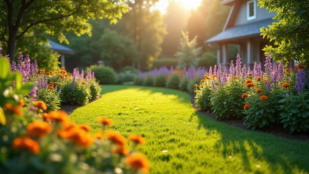
What You’ll Learn About Landscape Design Color Theory Basics
-
The core principles of landscape design color theory basics
-
How to apply color theory to create visually appealing gardens
-
Insight into professional landscaping standards and practices
-
Pro tips from an experienced, certified landscape company
Understanding Landscape Design Color Theory Basics
The Role of Color in Landscape Design
Color wields surprising power in landscape design, setting the emotional tone for any outdoor space. Bright, vibrant tones add energy, while cool blues and understated greens typically convey relaxation and calm. Effective use of color can draw the eye toward a focal point, connect separate parts of your garden, or even alter spatial perceptions—making small spaces feel larger or extensive beds seem intimate.
The color context—how hues interact with sunlight, shadows, and each other—establishes the “feel” of your space as much as the plants themselves. For example, the yellow of a coreopsis next to the rich green of an oak leaf visually pops, whereas subtle gradients of lavender and white create a soothing backdrop. Blending complementary or contrasting color schemes using the color wheel adds both excitement and coherence, aligning your design with professional standards seen on our home page and project showcases.

Primary Elements of Color Theory
-
Hue, saturation, and value explained: Hue refers to the color family (like blue, red, or yellow). Saturation measures the intensity—think a bright crimson versus a muted brick red. Value is how light or dark the hue is, affecting the mood you set in the garden.
-
Color harmony and contrast in garden settings: Color harmony is about creating an inner sense of unity and balance, while contrast provides excitement and visual variety. Color harmony keeps your design pleasing, while smart contrast highlights focal points or accent areas.
-
Use of warm and cool colors for visual impact: Warm hues (red, orange, yellow) advance and energize, making them suitable for gathering areas and entrances. Cool shades (blue, green, purple) recede, conveying relaxation
Applying Landscape Design Color Theory Basics in Your Garden
Building Color Schemes: Monochromatic, Analogous, Complementary
Crafting an appealing garden begins with choosing a color scheme that sets the design’s rhythm. Monochromatic color schemes use different values of a single hue. For example, various shades of green—from the moss underfoot to the variegated hosta—create tranquillity and unity. Analogous color schemes feature colors close together on the color wheel (like yellow, yellow-orange, and orange). These blends add interest without overwhelming the senses—think of a mix of golden rudbeckia, orange daylilies (plants that bear bright orange hues), and red-tipped grasses.
The complementary color scheme, uses hues directly opposite on the color wheel, such as purple and yellow or blue and orange. These pairings provide energizing contrast—making each individual plant stand out while maintaining a sense of unity. Incorporating these schemes makes for gardens that are both visually stimulating and effortlessly harmonious.
Incorporating Texture and Foliage to Enhance Color
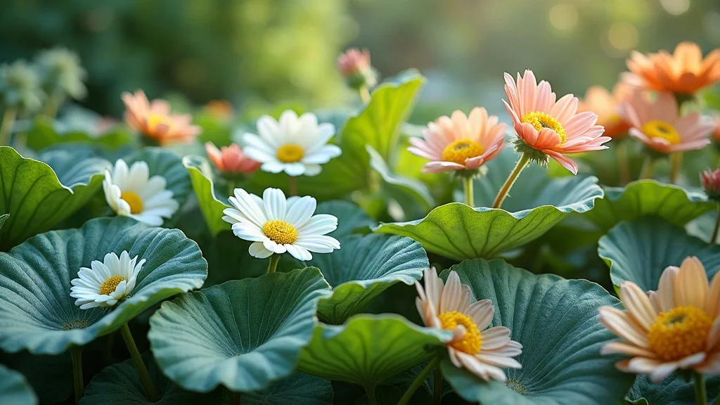
Color alone isn’t always enough—texture plays a vital supporting role in garden design. Mixing leaf shapes, plant sizes, and flower forms prevents monotony and enhances color’s impact. A rough ornamental grass next to glossy-leaved shrubs, or the spiky foliage of a daylily come to mind, helps reinforce your color choices, elevating the garden’s tactile appeal. Texture naturally guides the eye and keeps outdoor spaces dynamic throughout the seasons.
Layering plants with diverse foliage, such as the elegant silver-blue of a lamb’s ear against variegated hosta or bold coneflower petals, delivers year-round interest. Choices in hardscape—stone, wood, and even mulch color—blend seamlessly with plantings to reinforce your color harmony. Sustainable color selections, like drought-tolerant natives that retain vibrant color even in harsh conditions, make the garden visually rich and practical.
“Taking dirt and turning it into something beautiful is the heart of what we do.” – Jack Lantry, Owner
-
Combine colors for year-round interest
-
Blend hardscape materials and plantings
-
Practical tips for sustainable color choices
What is the 3-5-7 Rule in Landscaping?
How the 3-5-7 Rule Shapes Landscape Design Color Theory Basics
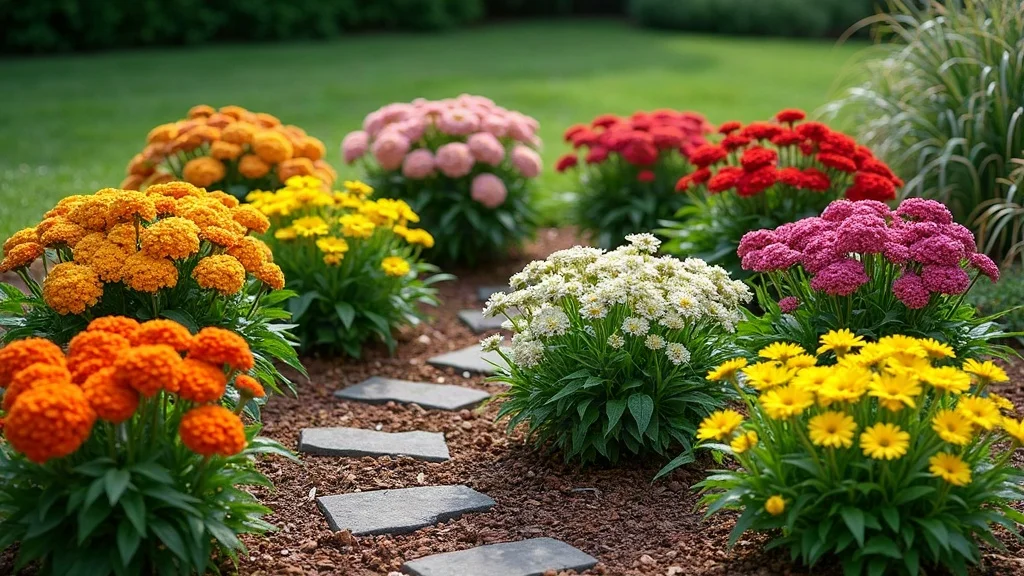
The 3-5-7 rule is a simple yet powerful guideline in landscape design color theory basics. It suggests grouping plants and features in odd numbers—like 3, 5, or 7—because this creates a more natural, visually balanced, and less rigid look than even-numbered arrangements. Odd groupings add harmony and rhythm, making the overall composition appear more dynamic and engaging to the eye.
For example, using the rule in planting—perhaps three purple salvias, five yellow coreopsis, and seven orange daylilies—ensures each grouping achieves balance and interest. This approach leverages the psychological response people have to odd numbers, which tend to feel less styled and more like what you’d encounter in nature. This fundamental tenet is a staple in professional designs and helps achieve natural color harmony alongside balanced plant placement.
-
Importance of odd-numbered groupings for visual balance
-
Examples of plant groupings using the 3-5-7 rule
Answer to “What is the 3-5-7 rule in landscaping?”
The 3-5-7 rule in landscaping means arranging plants or design elements in groupings of three, five, or seven. This odd-numbered approach helps create a balanced, natural feel and draws the eye smoothly throughout the space. By applying this rule, your garden avoids artificial or overly rigid patterns, achieving a look that is both pleasing and professionally polished.
What is the 60-30-10 Rule in Color Theory?
Integrating the 60-30-10 Rule with Landscape Design Color Theory Basics
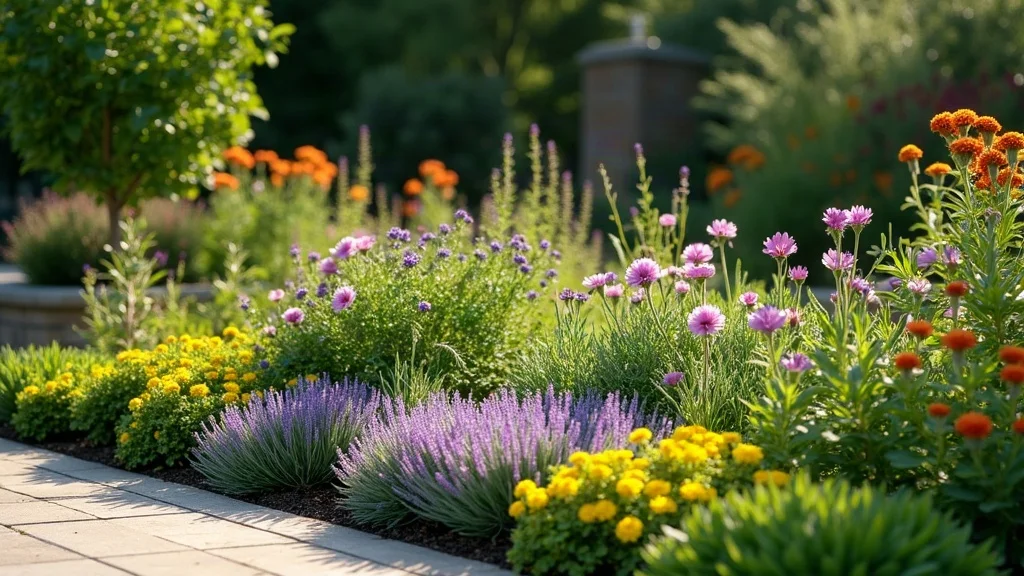
The 60-30-10 rule is a staple in color schemes—not just in interiors, but in landscaping too. This principle divides your overall garden color palette into three clear parts: 60% dominant color (often the green of foliage or lawn), 30% secondary color (flower bed hues like lavender or blue), and 10% accent color (a pop of vibrant yellow, orange, or red). This distribution creates an easy sense of color harmony, making each section of the garden both distinct and unified.
Start with a dominant backdrop, such as various evergreen shrubs or lush lawn. Add your secondary tone through mass plantings of something like purple sage or pink azaleas. Finish with bold accents: perhaps potted annuals or dramatic daylilies (plants that bear bright orange or gold flowers). Consistency here helps avoid a chaotic mix and keeps things visually clear. Following this rule is one of the best practices for achieving professional garden color composition.
-
Breakdown: dominant, secondary, and accent colors
-
Best practices for garden color composition
Answer to “What is the 60-30-10 rule in color theory?”
The 60-30-10 rule in color theory means structuring your color palette with one dominant color (60%), a secondary complementary color (30%), and a third accent color (10%). In landscaping, this ensures your garden looks balanced, lively, and purposeful, just like the pros do it.
Exploring the 7 Principles of Landscape Design Through Color Theory
Synergy Between Landscape Design Color Theory Basics and Design Principles
Blending color theory with the seven main landscape design principles creates gardens that are not only attractive, but also thoughtfully balanced. These principles—unity, balance, proportion, transition, rhythm, focalization, and simplicity—serve as the backbone of great design, with color acting as the thread that weaves them together.
For example, unity grows out of a consistent color palette while balance can come from symmetrical (or artful asymmetrical) color placement. Change value and saturation for proportion; use graded color shifts for smooth transition. Rhythm pops through repeated splashes of the same color, while contrast creates focalization (a strategic pop of primary color draws the eye). Simple, pared-down palettes enforce simplicity, ensuring your garden doesn’t feel cluttered or overwhelming. These ideas come straight from our project experience at LaBarge and match the highest professional standards.
-
Unity, balance, proportion, transition, rhythm, focalization, and simplicity
-
Practical color-based examples for each principle
Answer to “What are the 7 principles of landscape design?”
The seven principles of landscape design are unity, balance, proportion, transition, rhythm, focalization, and simplicity. Using landscape design color theory basics alongside these concepts ensures your garden is cohesive, visually appealing, and easy to enjoy throughout the seasons.
Defining the Five Basic Landscaping Design Principles Using Color Theory
Linking Landscape Design Color Theory Basics to Basic Principles
The five basic principles—simplicity, variety, balance, emphasis, and sequence—are easy to implement when you understand landscape design color theory basics. Simplicity favors a restrained color palette, while variety adds interest with new hues or different textures. Balance, as described above, leverages both color mass and plant placement.
Using strong accent colors for emphasis (perhaps a vivid red or bright yellow bloom at your focal point) and thoughtfully alternating hues for sequence ensures a smooth and satisfying journey for the eye. This approach supports not only personal visual pleasure but also the professional-level polish we strive for at LaBarge.
-
Simplicity, variety, balance, emphasis, and sequence in color selection
-
How color supports the overall landscape design
Answer to “What are the five basic landscaping design principles?”
The five basic landscaping design principles are simplicity, variety, balance, emphasis, and sequence. When united with effective color choices, these principles ensure every plant and feature plays a meaningful role in your garden’s beauty.
Table: Landscape Design Color Theory Basics at a Glance
|
Principle |
Description |
Color Theory Application |
|---|---|---|
|
Unity |
Visual cohesion of elements |
Consistent color palette |
|
Balance |
Symmetrical/asymmetrical composition |
Distribution of color masses |
|
Emphasis |
Creating focal points |
Strategic use of contrasting colors |
Frequently Asked Questions on Landscape Design Color Theory Basics
-
Why is color theory important in landscaping?
Understanding color theory is crucial because it helps create visually cohesive and intentional gardens. Smart color use adds harmony, draws attention to focal areas, and communicates mood, making your outdoor space both beautiful and functional. -
How can novices start using color schemes in gardens?
Beginners should start by choosing a simple color palette, such as analogous or monochromatic, and use plant finders for recommendations. Begin with groupings and use the 3-5-7 rule for layout, gradually adding complexity as you become more comfortable. -
How do seasonal changes affect color planning?
Seasonal shifts impact flower and foliage colors, so plan for year-round appeal. Use evergreens for structure, layer with perennials that bloom in different seasons, and add annuals for quick pops of color, ensuring interest during every time of year. -
What are some common mistakes with landscape color?
Common mistakes include using too many colors without a clear scheme, ignoring balance and contrast, and planting only for one season. Avoid chaos by planning your palette and sticking to proven color theory basics for long-lasting appeal.
Key Takeaways for Mastering Landscape Design Color Theory Basics
-
Color theory forms the foundation of impactful garden design
-
Odd-number groupings, like the 3-5-7 rule, enhance visual interest
-
Balanced color application (60-30-10 rule) leads to professional results
-
Principles of design and color should work hand in hand
Discover the LaBarge Difference in Landscape Design
Elevate Your Outdoor Space with Our Expertise
-
Family-owned, local experience spanning over 40 years
-
Fully licensed, certified, and insured landscaping professionals
-
Personalized designs tailored to your vision
-
Satisfaction from countless residential and commercial clients
Ready to Create Your Stunning Landscape?
-
Contact us or call us at (505) 345-3000.
Conclusion: With color theory at your fingertips, your dream landscape is within reach. Trust local experts and proven design principles to transform your outdoor space into a living masterpiece.